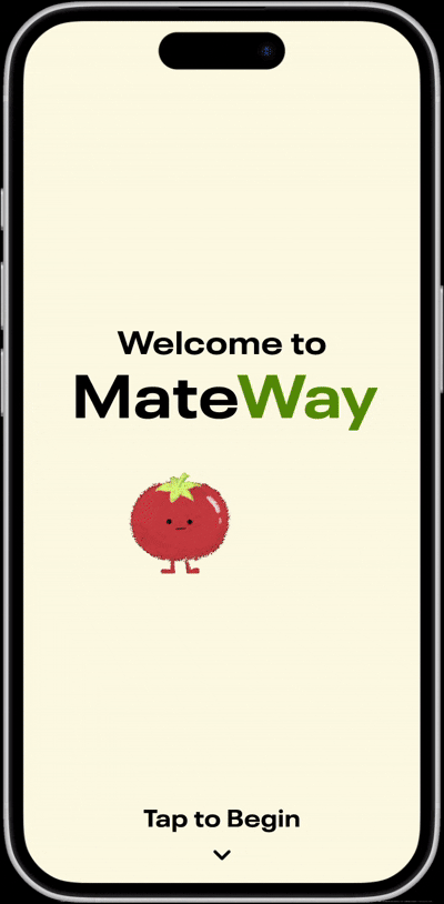
Mateway
My role
UI/UX Designer (Persona Creation, Kiosk Design)
Timeline
November 16, 2025 (8 hours)
Tools
Figma, Canva
Empathize
Shirley's Story
Shirley doesn’t have a home. She doesn't know when she will get her next meal, where she will stay for the night, or when the cold will finally be too much for her thin jacket. Food, shelter, and clothing are variables that feel out of her control. Information and help exist, but they are oftentimes outdated or locked behind technology she can’t access. The only certainty Shirley has is her uncertainty.
And she isn't the only one.
Here Is What We Know
Between 30,000 and 35,000 people are homeless on any given night in Canada.
In 2024, 25.5% of Canadians lived in food-insecure households (approx. 10 million people).
Homelessness costs Canada $10 billion annually to maintain shelters and provide other resources.
The Other Side
Marie is a middle-aged woman and an empty nester. Her three children have gone off to university, yet she still buys groceries in bulk out of habit. She often finds that she ends up having more than she needs, and wishes she could share it with others. She has tried finding donation systems for fresh, perishable items, but has found they are inconvenient and hard to navigate.
"Who needs this food?"
"Where do I take it?"
"Is this even allowed?"
The effort required often outweighs the intention, and Marie feels guilty time after time as the food quietly goes to waste.
Define
"How might we design solutions that help people connect, care, and thrive, empowering both the individual and the community?"
This was the prompt we were given for the Canvas 2025 Designathon, hosted by UW Blueprint. In the name of Blueprint, my team and I (consisting of 4 designers in total) wanted to serve a community in need and design with the greater good in mind. Our vision was to create a solution that could get the whole community involved and empower every member within it.
Problem Statement 2.0
During our time at university, we were frequently exposed to people experiencing homelessness through the shelter next to our campus, as well as the large homeless population in the city's midtown. It was clear that both groups faced significant challenges in accessing resources and support. The real driving factor is not scarcity of total resources, but rather poor distribution coupled with a suffering economy. With that in mind, we synthesized our findings into a more targeted problem statement to drive our approach in designing a solution:
"How might we improve the accessibility and distribution of resources for individuals experiencing homelessness, while fostering a sense of community among all members of society?"
Ideate
Our Thought Process
We decided from the start that we would prioritize accessibility. At first, it was tempting to cheap out and design solely a mobile interface, however we concluded that it would not be reasonable to assume everyone had the technology required to run the application. We also considered making it a software accessible through public libraries and community centre servers. Unfortunately, after considering its implications and the possible stigma against homeless people in those spaces, we concluded that it would be the opposite of empowering to design such a solution.
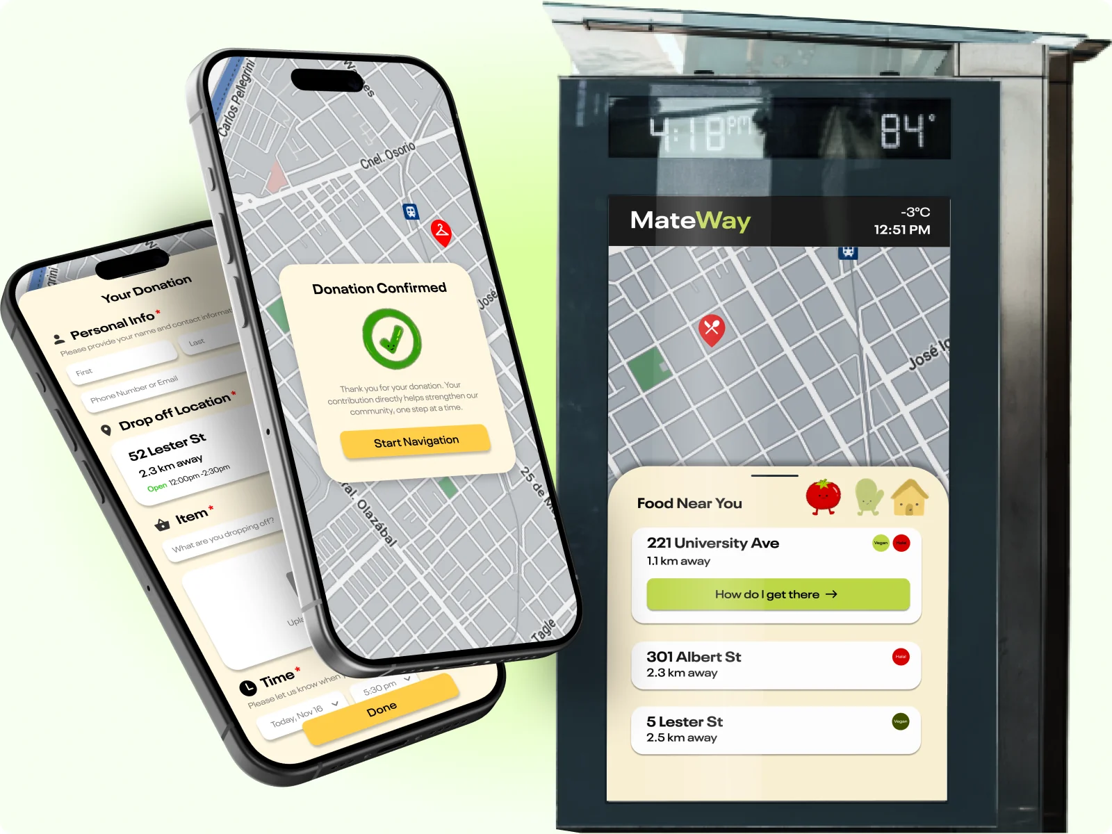
So, Why A Kiosk?
Inspired by the navigation kiosks found in malls and public transit areas, we identified them as an effective and dignified way to connect individuals in need with essential resources. Because kiosks are already normalized in shared public spaces, their use does not single out or stigmatize users. Instead, they allow individuals to seek support discreetly and on their own terms.
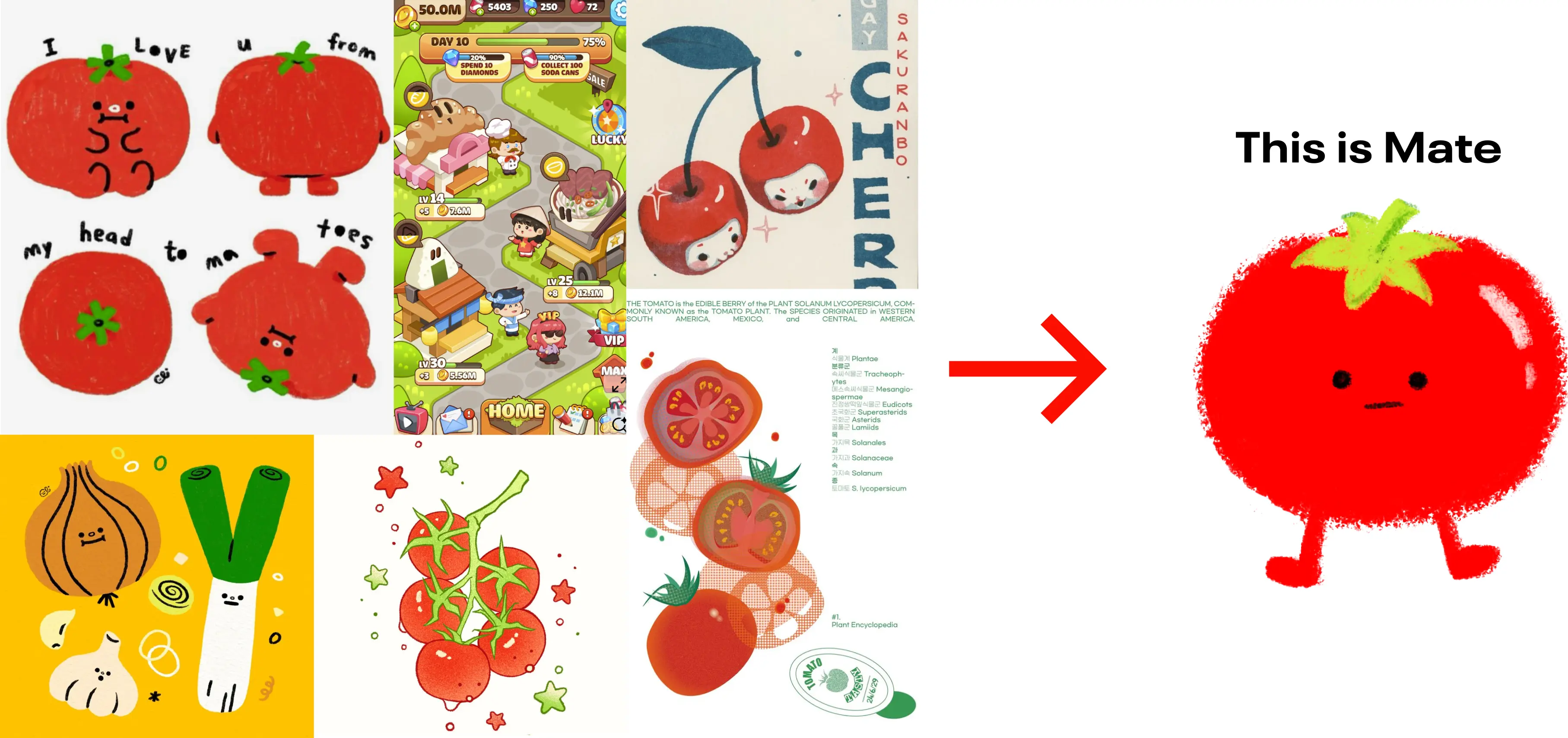
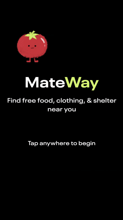
The Power of A Little Whimsy
To gain a general feel for the interfaces, we gathered some inspiration. I firmly believe in the importance of delight in design, which I wanted to bring into this project. And thus, Mate the tomato was born!
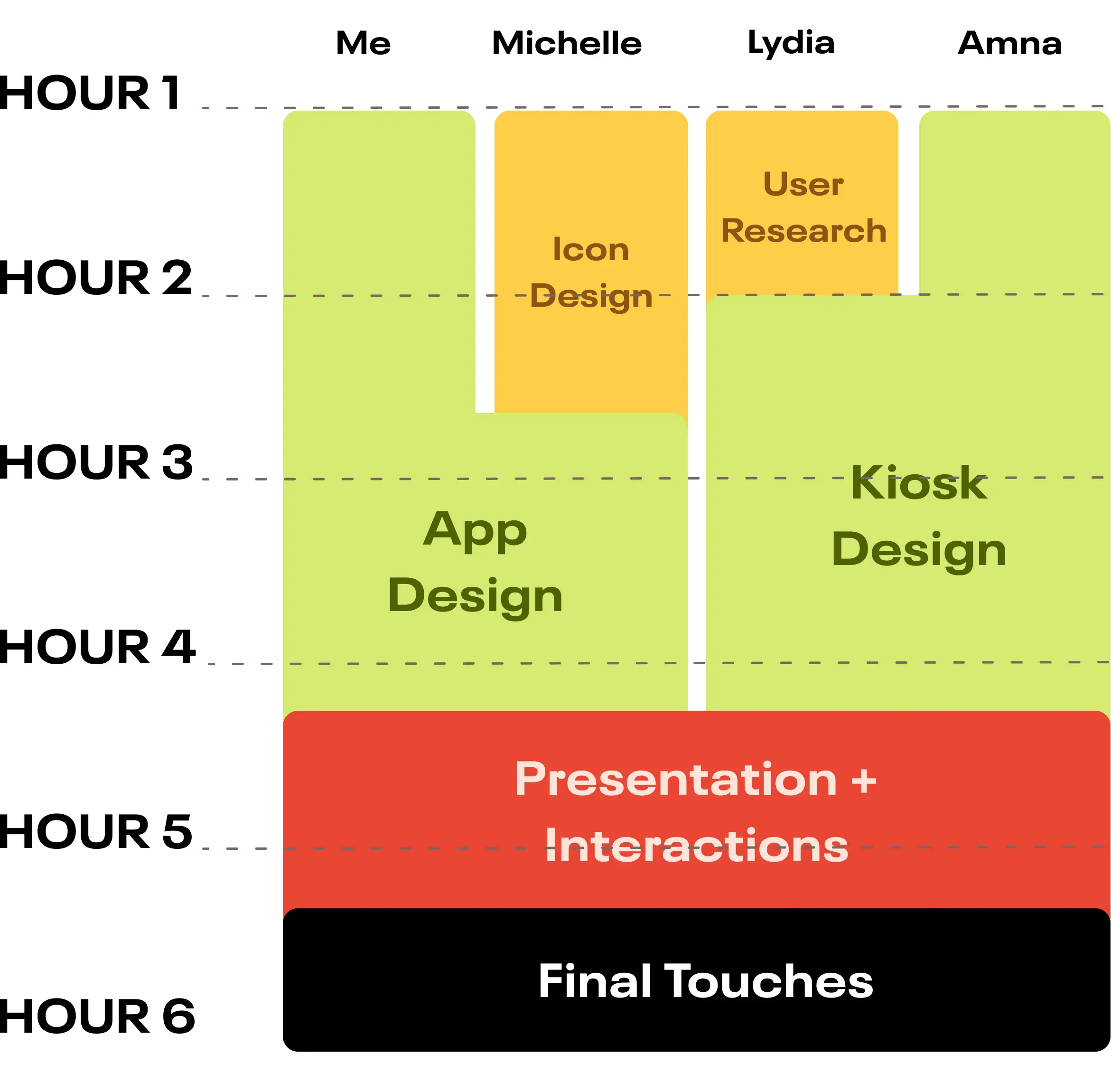
Divide and Conquer
To maximize the six hours we had left, my team and I split the work into staggered blocks.
Final Designs
Kiosk Interface