Munch Mark
My role
Solo Designer (user + competitive research, wireframing, prototyping, the works!)
Timeline
May 2025 - June 2025
Tools
Figma, Miro
Context
Picture this: you're standing at the front of the line at a bubble tea shop you’ve visited countless times before. Somehow, you still don't know what to order. The name of the drink order you had last time you visited (that honestly changed your life) now eludes you. With a line behind you and a cashier waiting, you settle with the most popular drink and hope for the best.
That may or may not have been a personal anecdote, but it got me thinking: "What if there was a way to keep track of bubble tea flavour ratings so they can be quickly accessed last minute when you don't know what to order?"
Empathize
Is Food Indecision Really An Issue?
To validate whether this product would have demand, I looked into existing research on how people make food decisions and the stress around ordering food. A few key findings are highlighted below:
A survey found that over 30% of Americans experience “menu anxiety,” feeling stressed or overwhelmed when deciding what to order from a restaurant menu. (Psychiatrist.com, 2024)
Research shows that about 86% of Gen Z adults experience menu anxiety, driven by decision fatigue and fear of ordering when confronted with multiple food options. (Benzinga, 2024)
Studies on the paradox of choice suggest that having too many options can increase anxiety and reduce satisfaction, because an abundance of choices requires more cognitive effort and can lead to regret or decision paralysis. (Schwartz, 2004)
Overall, these insights made me realize that a tool like Munch Mark that helps people recall what foods they’ve liked before addresses a real cognitive pain point and is a product worth developing.
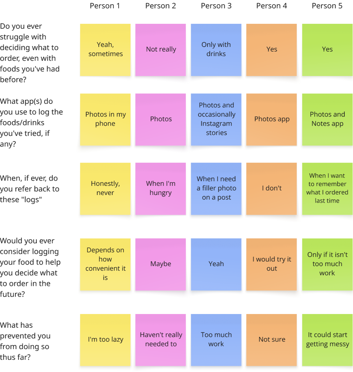
What Did My Peers Think?
To begin my design process, I interviewed 5 of my peers to gain insight into their current food logging habits. I identified the following:
4/5 struggle with food indecision
Only 1 person actively logs their flavour preferences for future reference
5/5 would try a food-logging app (3/5 contingent on convenience)
Define
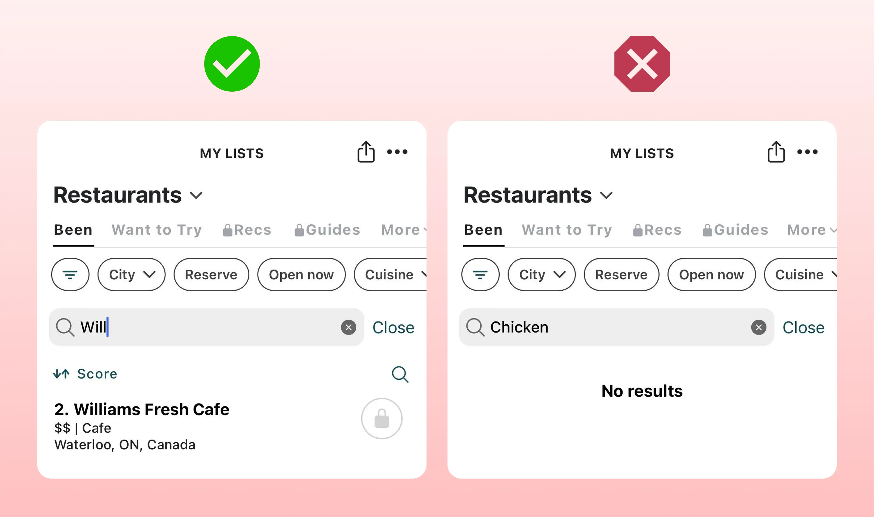
But Beli Exists Already
Beli, a popular food rating app, is Munch Mark’s biggest competitor. However, it is designed primarily for restaurant discovery rather than revisitation. Its UX emphasizes recommendations and encourages users to explore and rate new places.
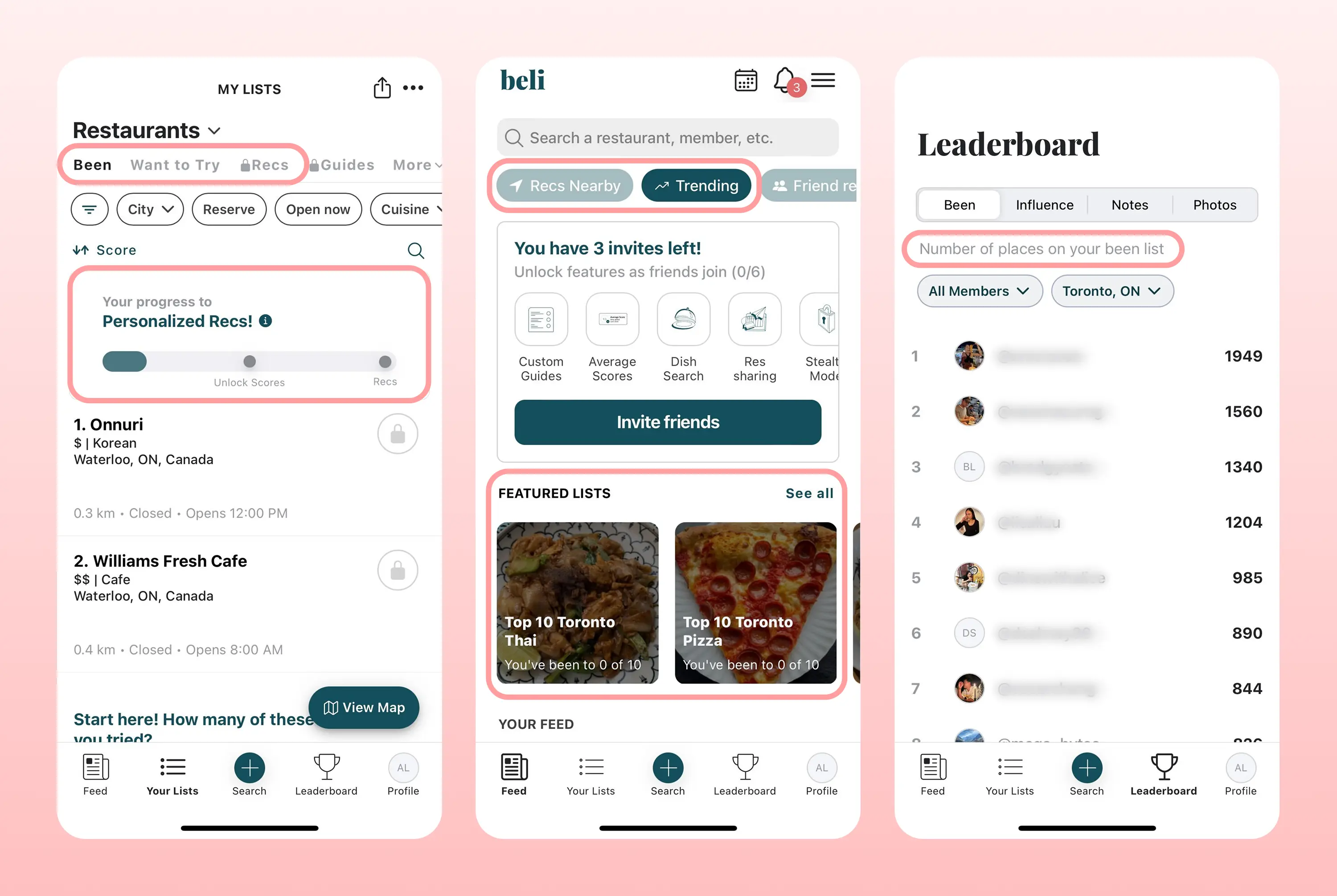
Furthermore, I identified two main pain points in its user flow that make it less ideal for quick logging and retrieval.
Pain point 1: Tedious navigation to view past orders
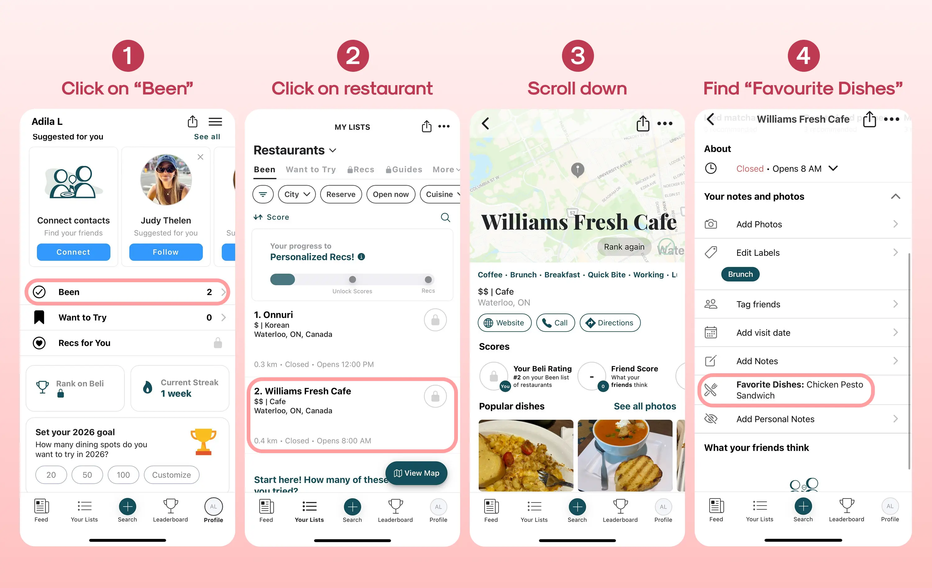
Pain point 2: Search limited to restaurant names
Narrowing Down The Problem
With the findings above, I formed the problem statement:
How might we support faster, more confident food decisions by helping users revisit foods they’ve previously enjoyed?
In the context of this problem statement, I then condensed the pain points in Beli's user flow into two main issues:
1. Unintuitive and messy log storage
2. Difficulty locating logs on a time crunch
Ideate
My Solutions
Issue: Unintuitive and messy log storage
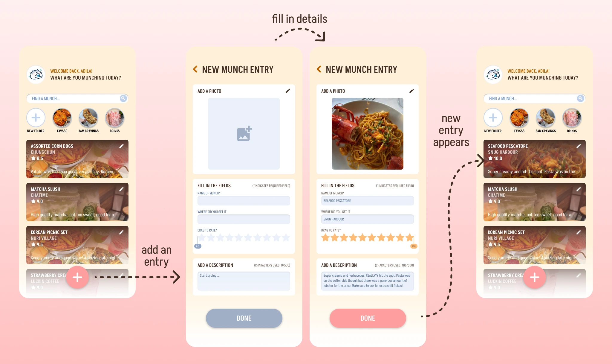
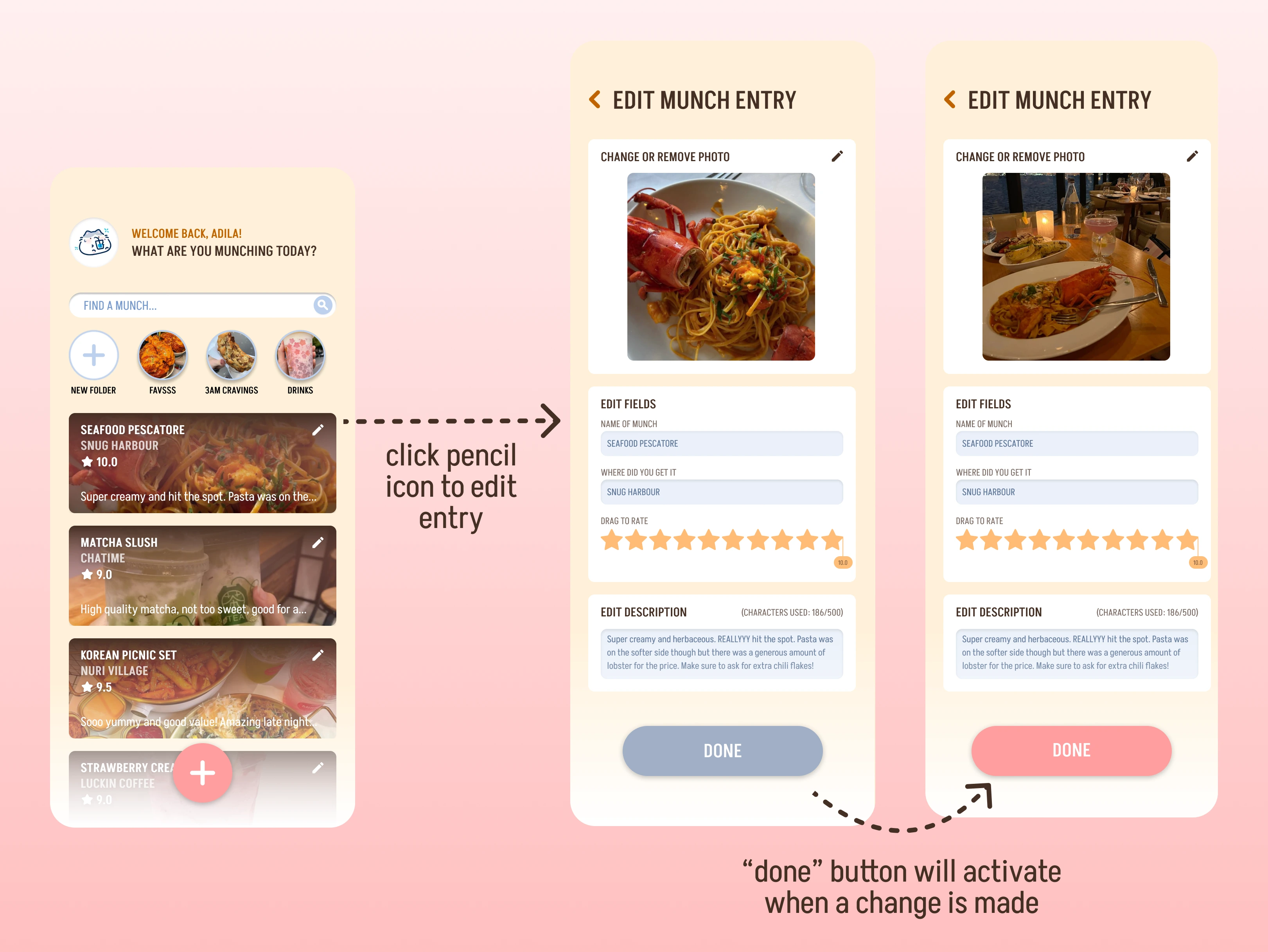
💡 Solution: Standardized log creation page with minimal fields to be filled out.
Issue: Difficulty locating logs on a time crunch
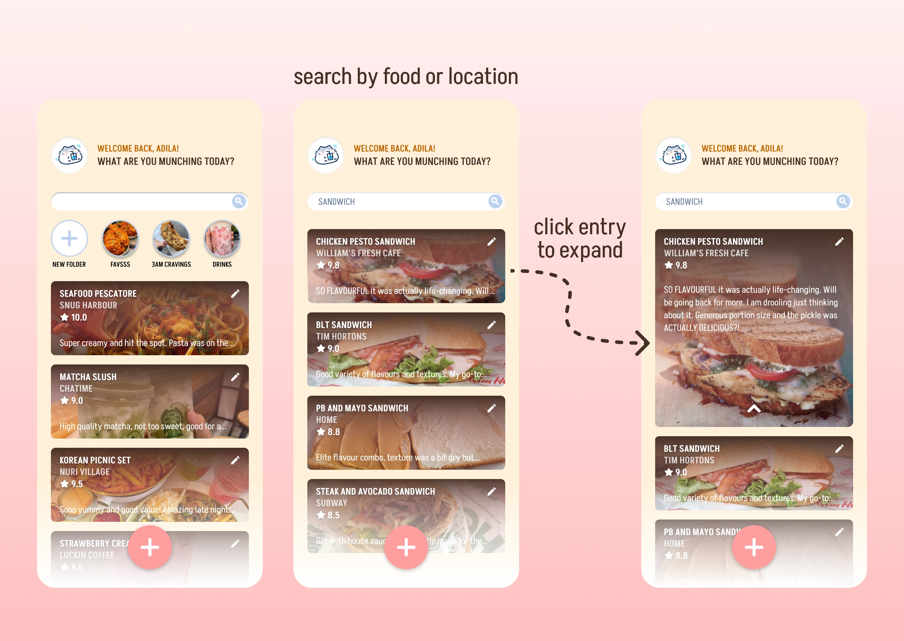
💡 Solution: Search function that covers all key words (both restaurant and food), accessible directly through app landing page.
During my brainstorm, I also came up with some "nice-to-have" features, such as a social aspect for friends to connect and a map showing places the user has been to (admittedly heavily inspiration by Beli). Some of these features were brought into my initial design, however I later discarded them to keep the MVPs at the center of the product.
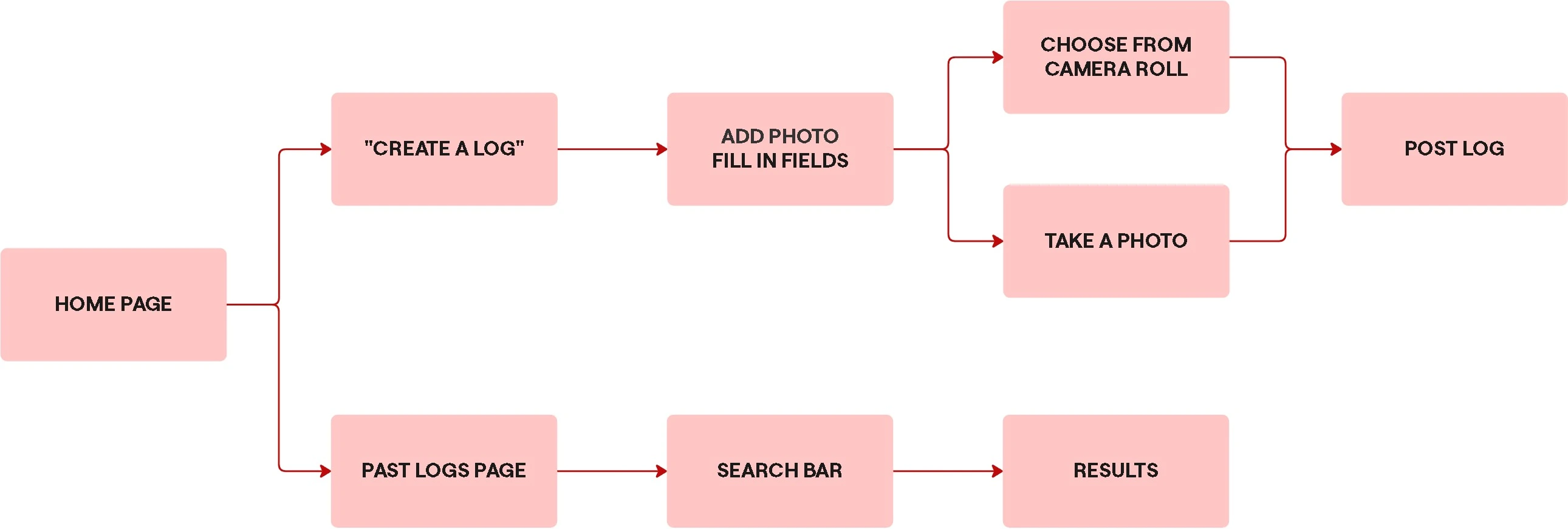
User Flow v1.0
To gain more clarity before I began designing, I mapped out the flow between MVPs. Spoiler alert: this initial flow is a LOT different from the final :"D
Prototype
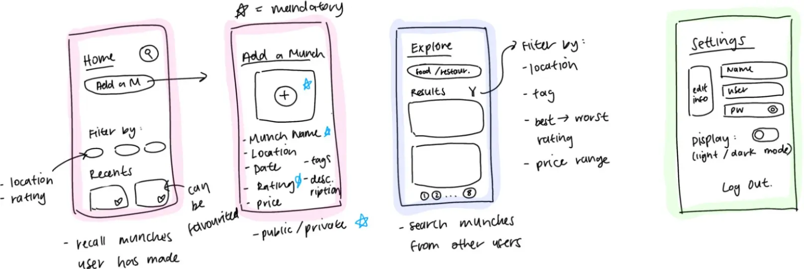
Sketching Out Some Ideas
The low-fidelity designs I drew kept things minimal:
Pink = flow from home page
Blue = search function (for personal and other users' munches)
Green = settings to account for accessibility features (screen contrast, user info, user privacy)
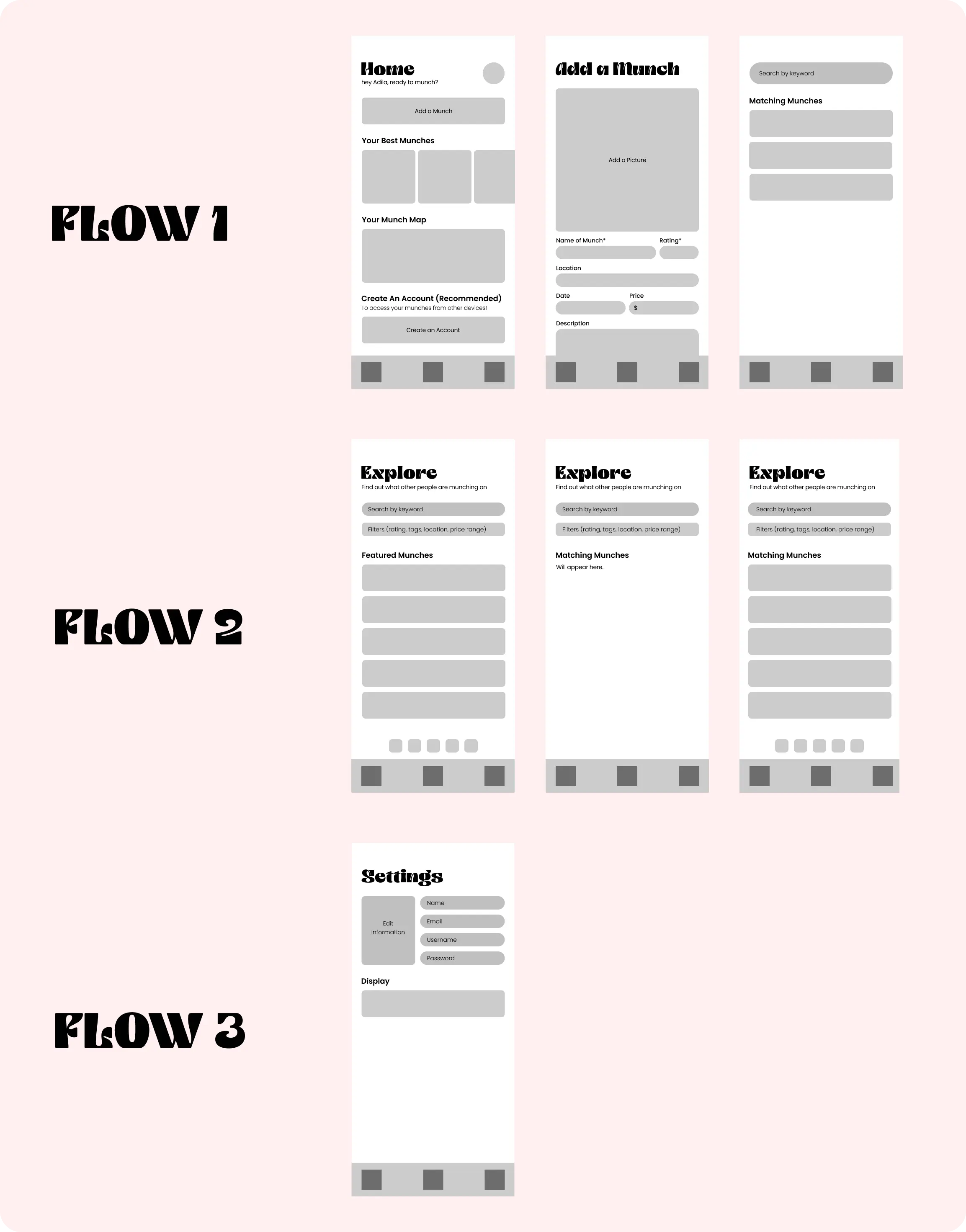
Mid-Fidelity Prototypes
Flow 1: Main features (home screen, logging feature, log searching feature)
Flow 2: Social feature (to search other user’s munches)
Flow 3: User settings (for user information/privacy/accessibility edits)
The First Iteration
After evaluating this first design, I realized it left much to be desired. I felt it missed the mark on clarity and user experience for the intended use case, so I did a major redesign. Notable issues and improvements made in the following iterations are detailed below!
Home (Page) Renovations
Approaching the design from the perspective of the user allowed me to identify and rectify three glaring issues:
1. The "Explore" page feels out of place in the overall app function.
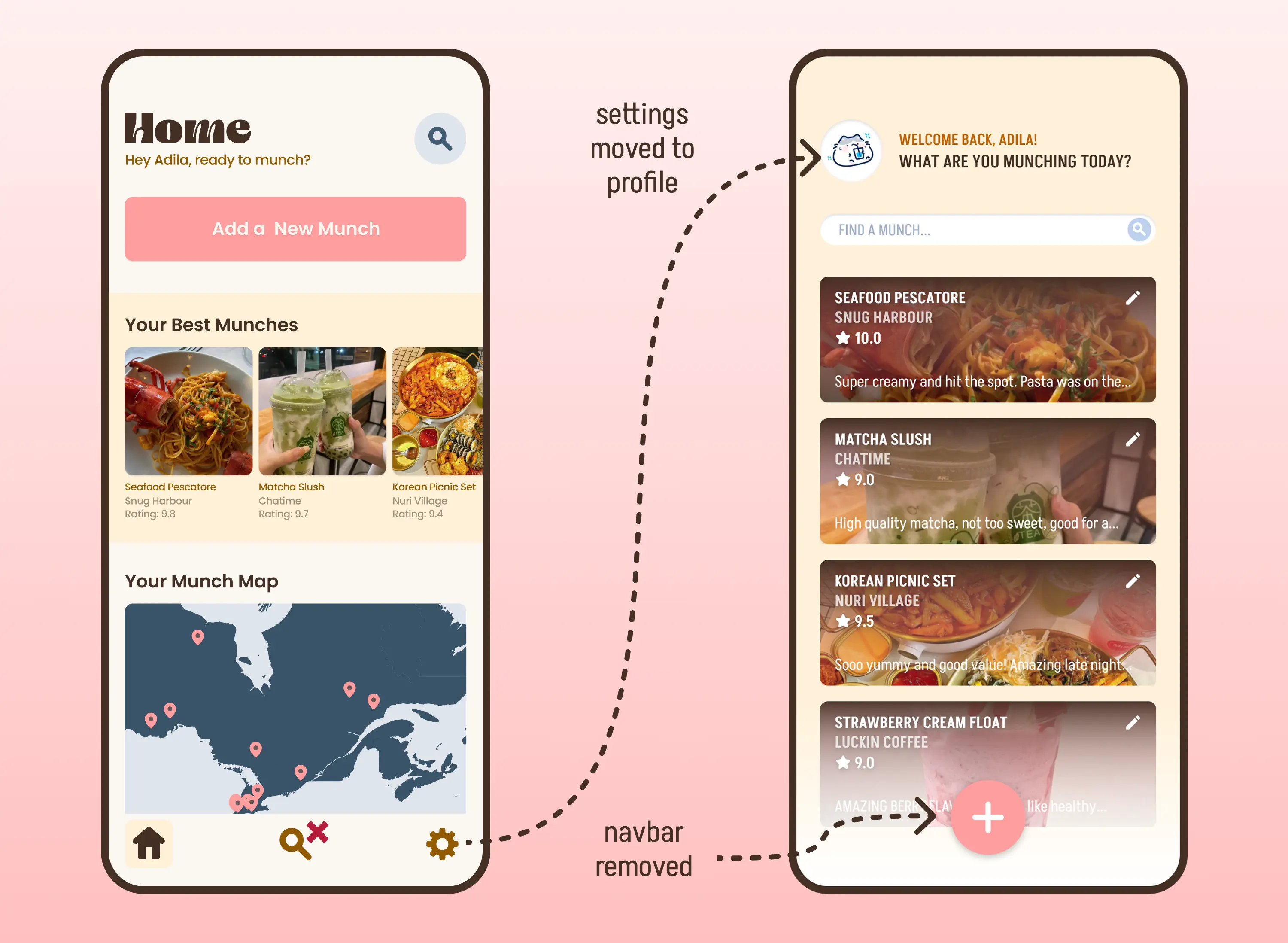
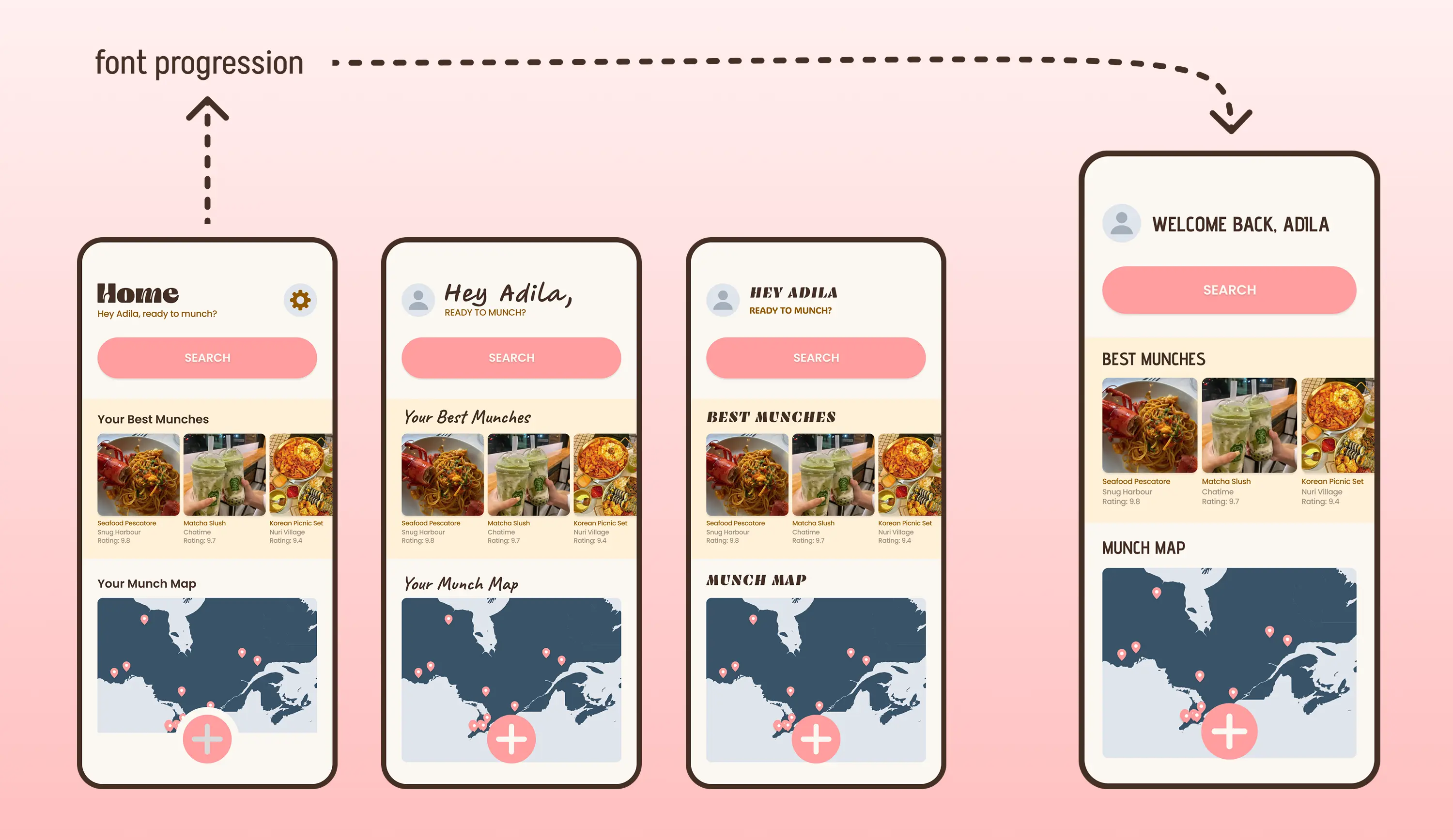
2. The heading font is pretty, but too stylized to be accessible.
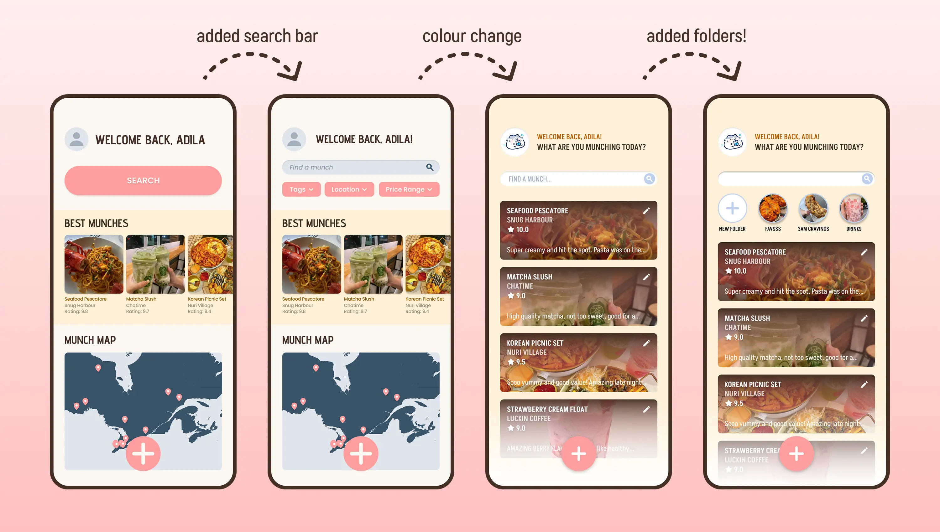
3. The “Search” icon needing a click to expand adds a meaningless step to the user flow, which takes away from the MVP.
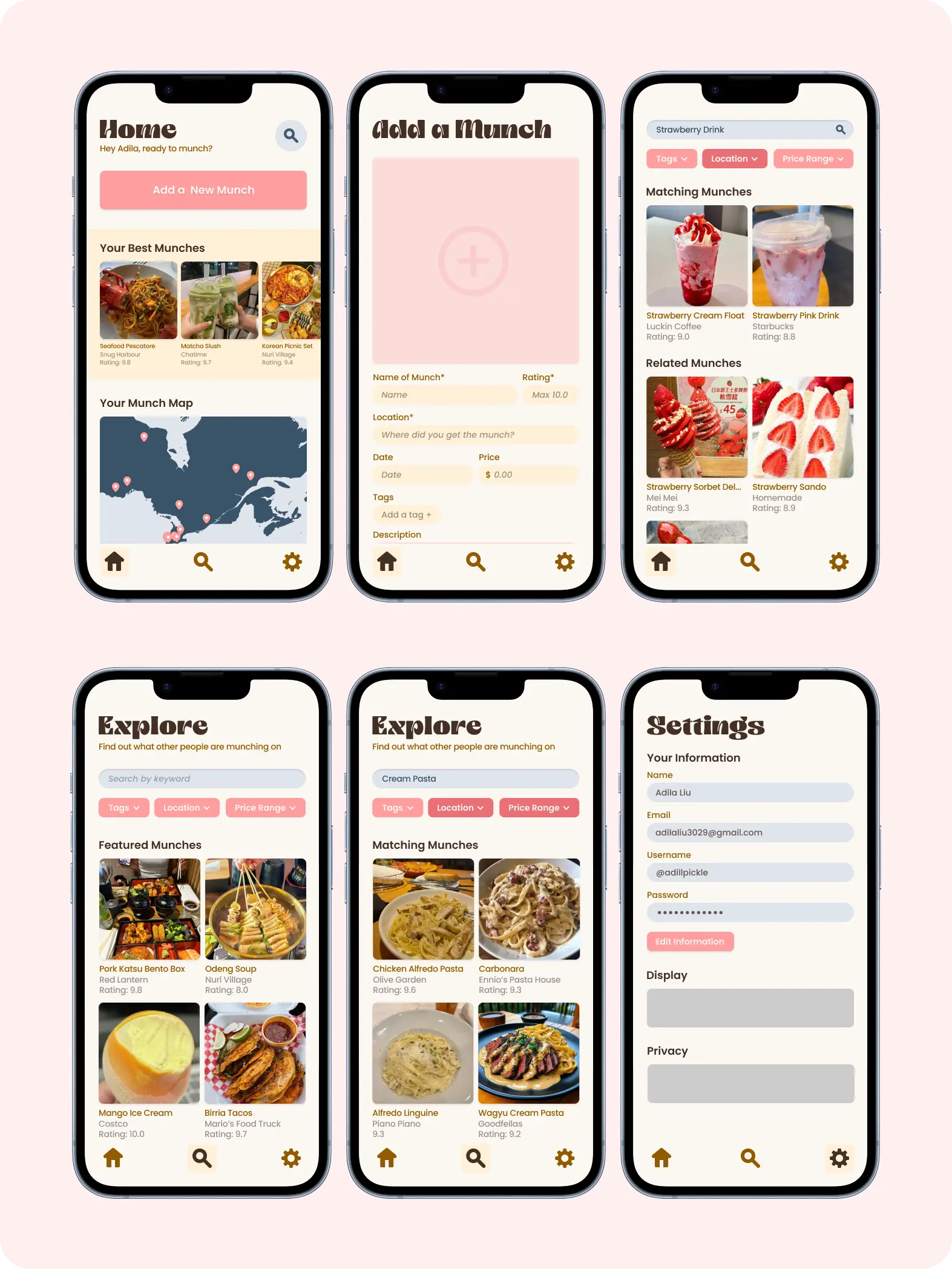
Final Designs