Swapparel
My role
UI/UX Designer (UI design, user journey mapping, prototyping)
Timeline
July 2025 - August 2025
Tools
Figma
Context
Project Background
Swapparel is a group project I completed with a team of 4 other designers for a Customer Experience Design course. Below are the details of the project, with my contributions highlighted!
Another Clothing App?
Depop, Poshmark, and even Facebook Marketplace already exist in direct competition to Swapparel. What makes this app special?
Well technically, it's FREE clothes ✨
Clothing swap events have been gaining popularity lately among the younger generation as a more sustainable and budget-friendly way to thrift. The concept of thrifting has been made digital through the aforementioned apps already, however Swapparel offers a more niche twist: employing the user experience of apps like Depop to facilitate secure clothing swaps.
Empathize
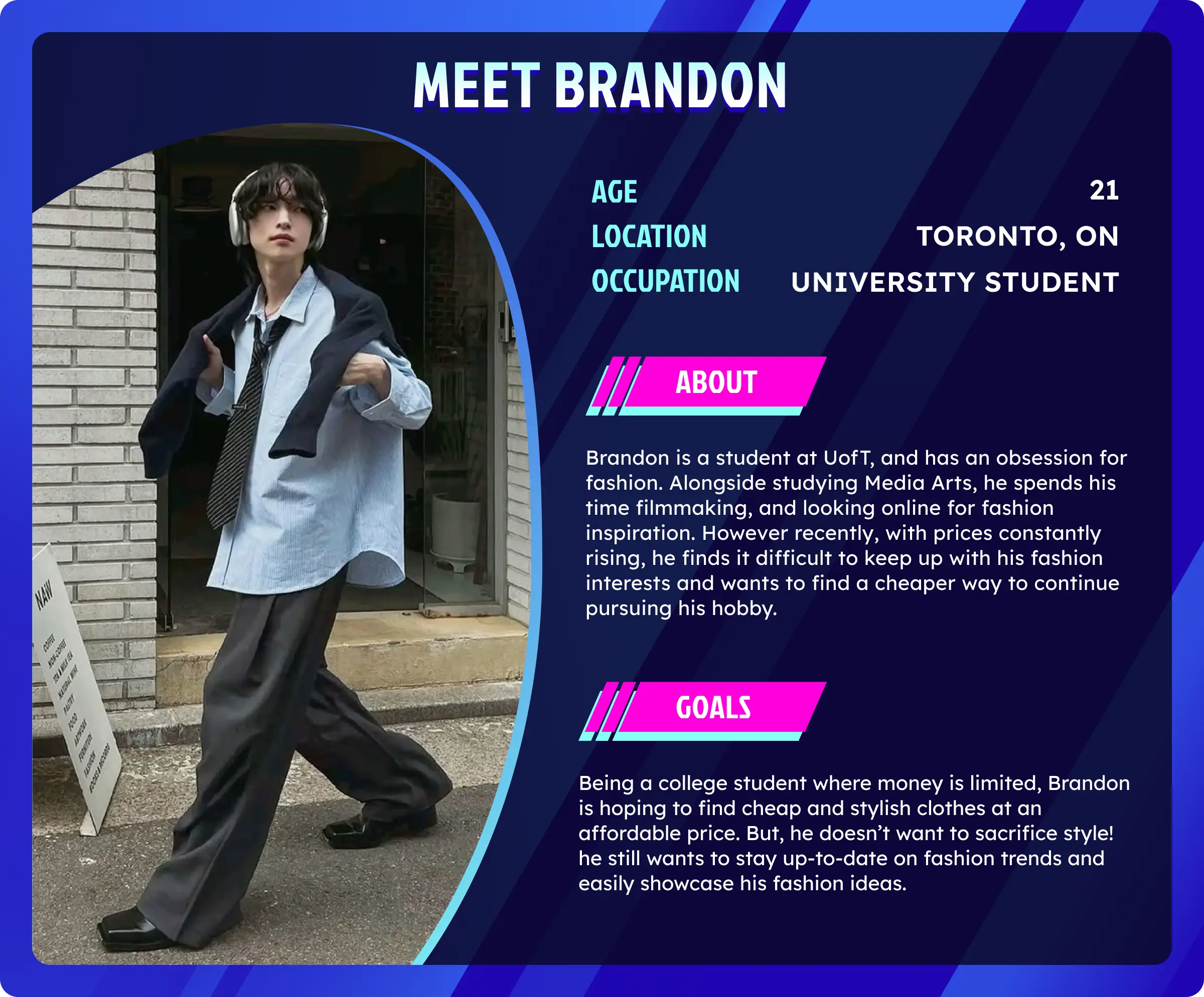
Persona
To better empathize with our users, we created a persona named Brandon.
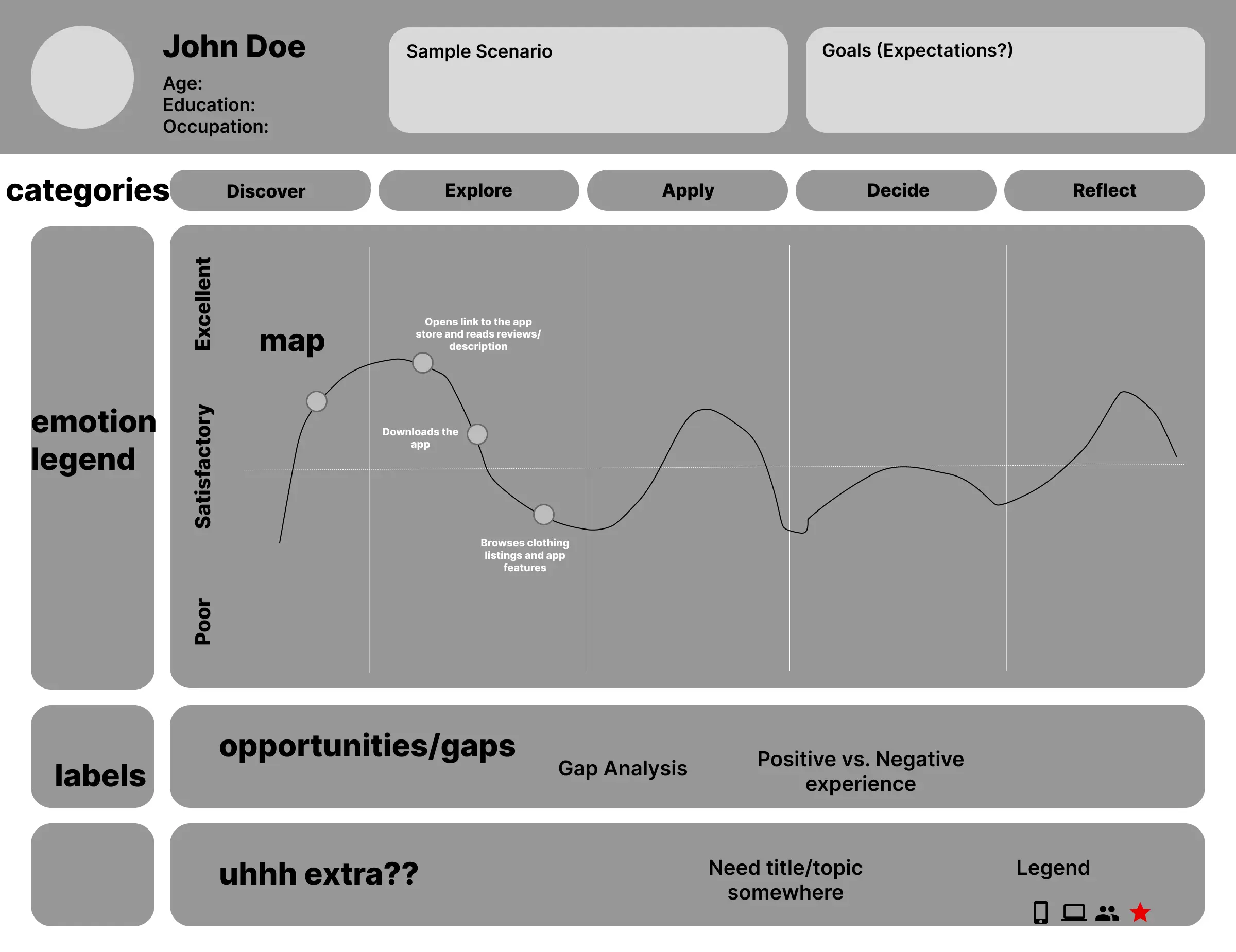
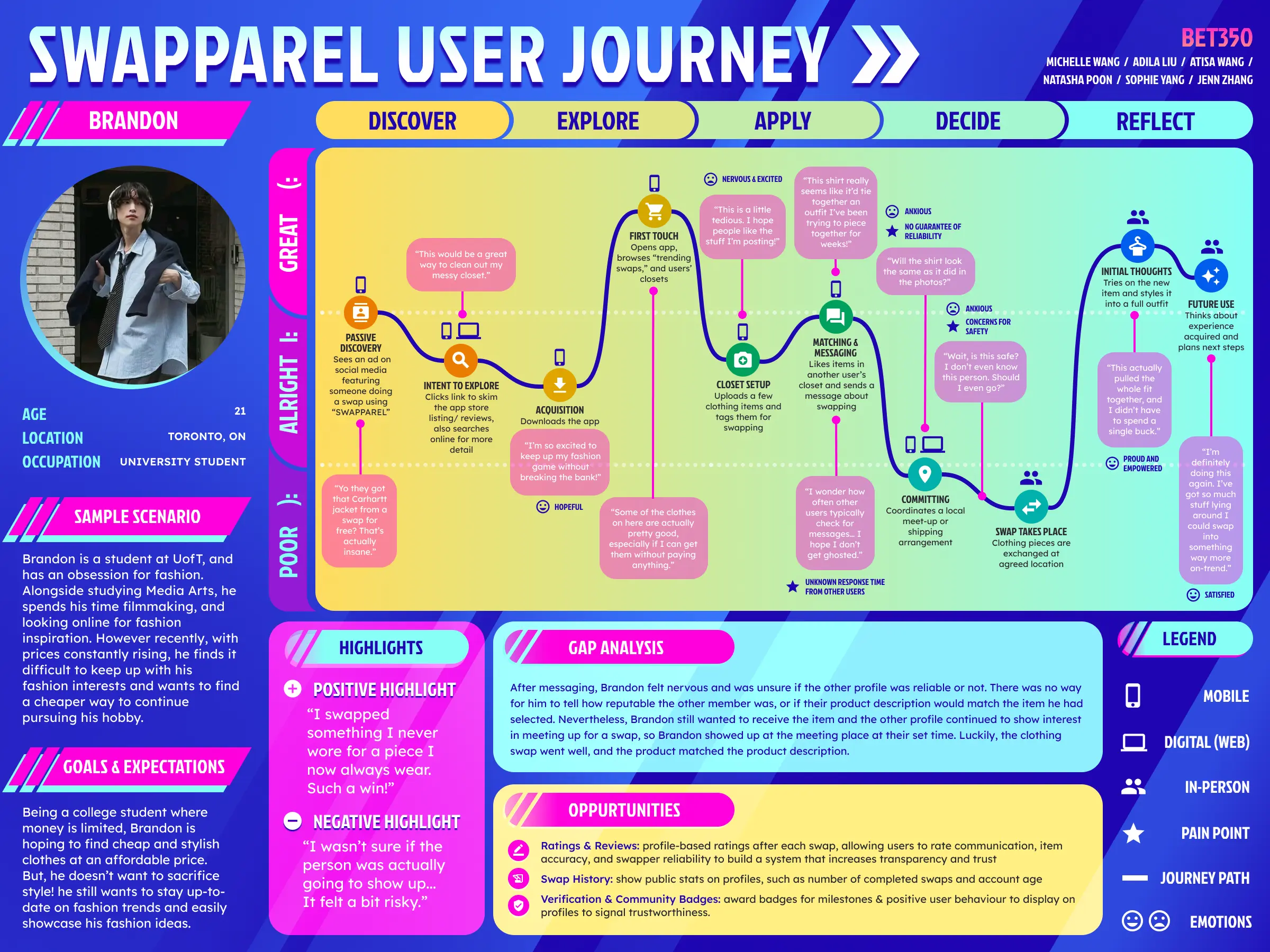
User Journey Map
We also created a user journey map to simulate how Brandon would navigate our app. I was in charge of designing the page and turned it:
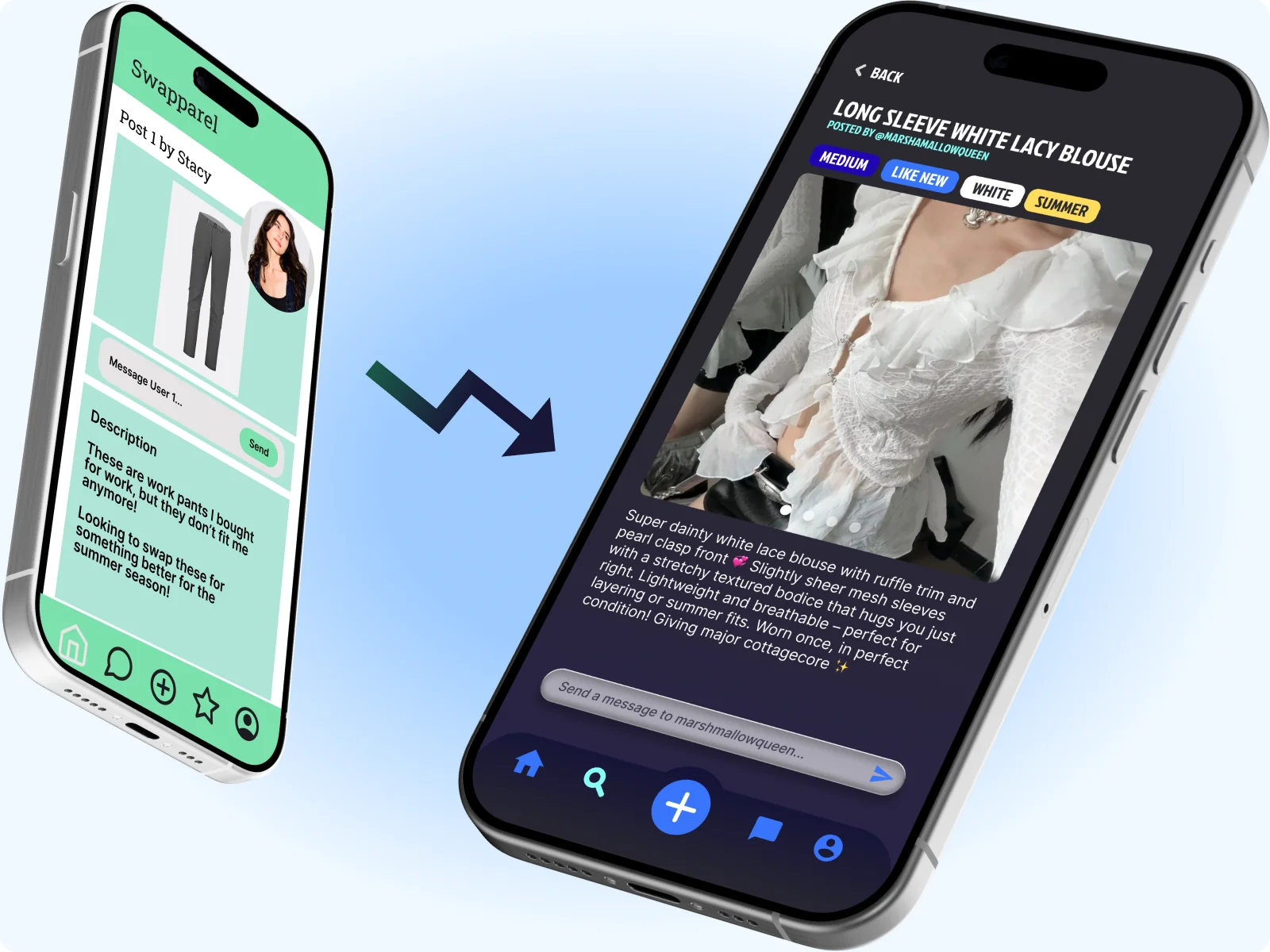
from this...
...into this!
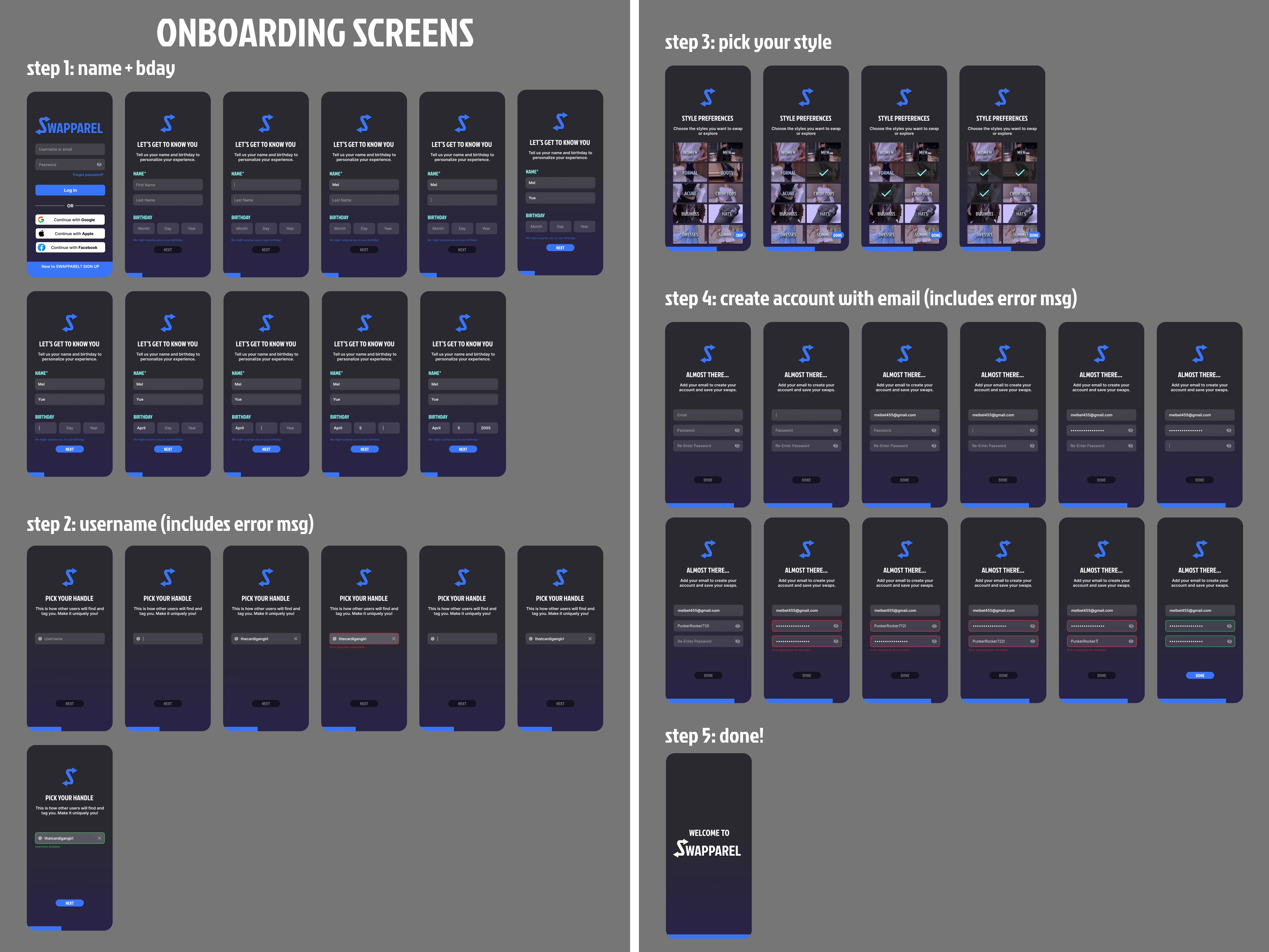
First Steps
Inspiration
One of the glaring issues in the initial UI was the colour palette. The combination of green, pink, black, gray, and white felt plain and lacked direction. As such, I began the redesign process by finding some inspiration on Pinterest!
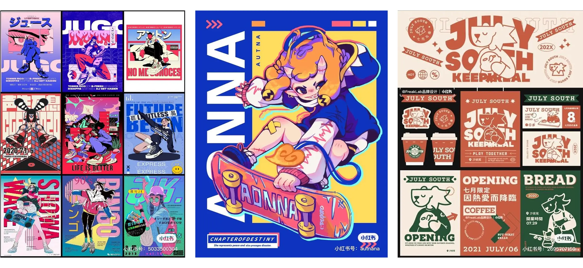
I wanted to go for a futuristic, yet minimalist vibe to match the trending design styles today. Some common themes I spotted among designs I liked were bold colours, rounded corners, and text-based logos.
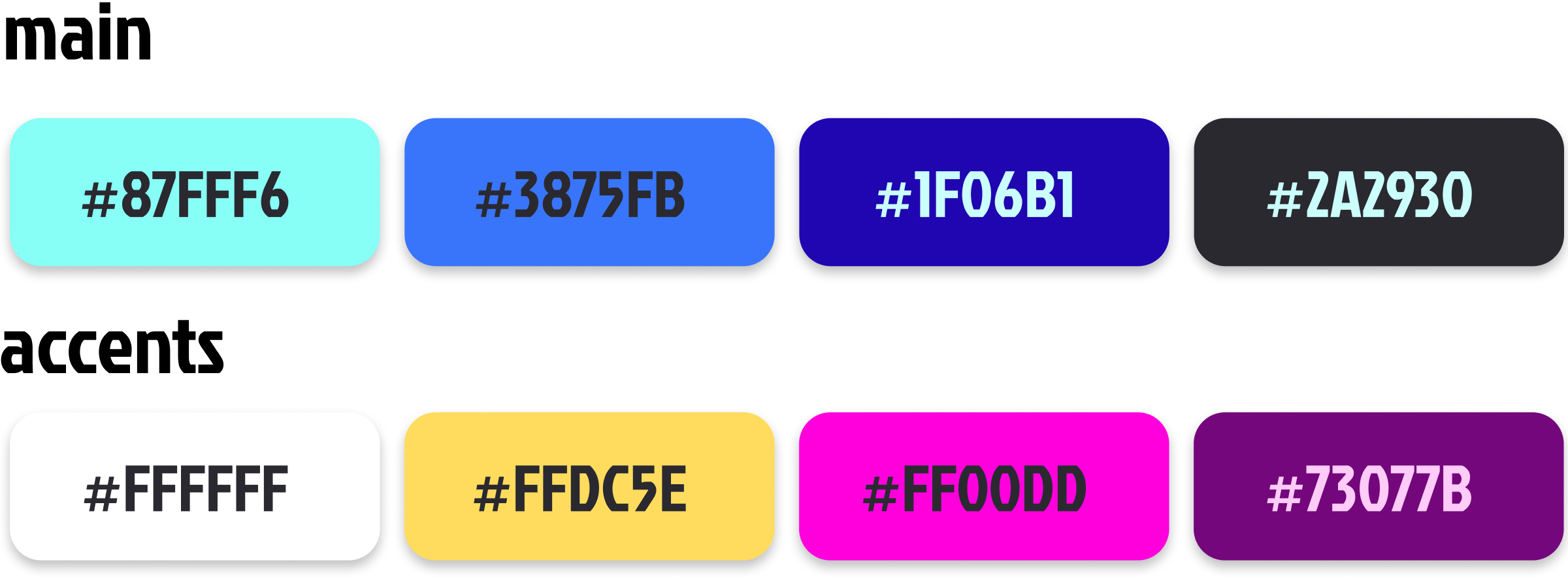
And That Inspired Me To Create This Colour Palette
And This Logo!
Improvements
Nav Bar Glowup
The icons in the initial prototype were not stylistically consistent, particularly in the navigation bar. I imported a new set of icons and redesigned it to match the new design system.

Before

After
Spacing Corrections
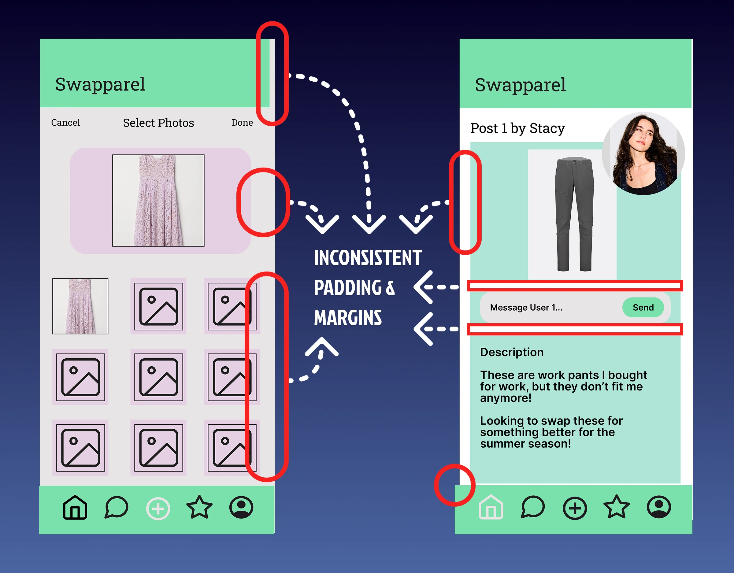
Previous Spacing + Alignment
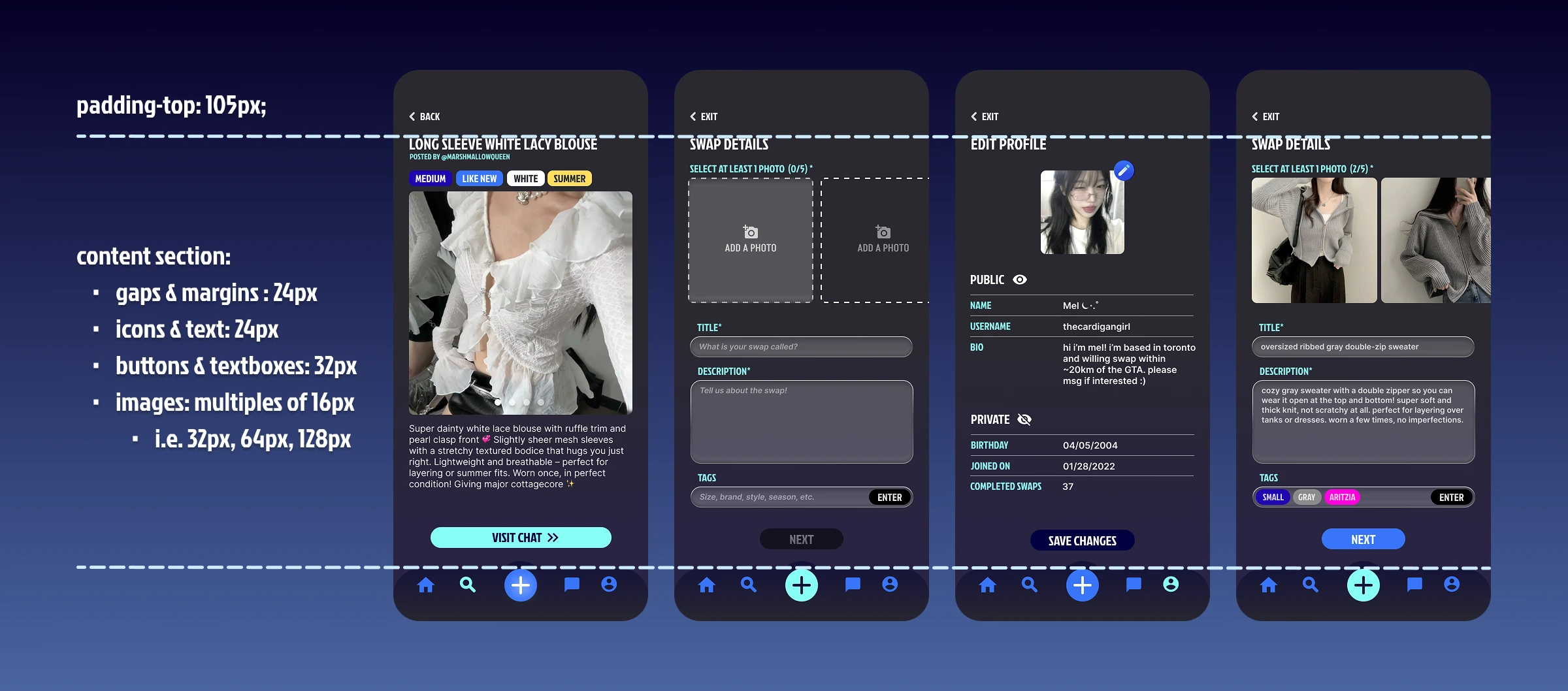
Fixed Spacing + Alignment
New Additions
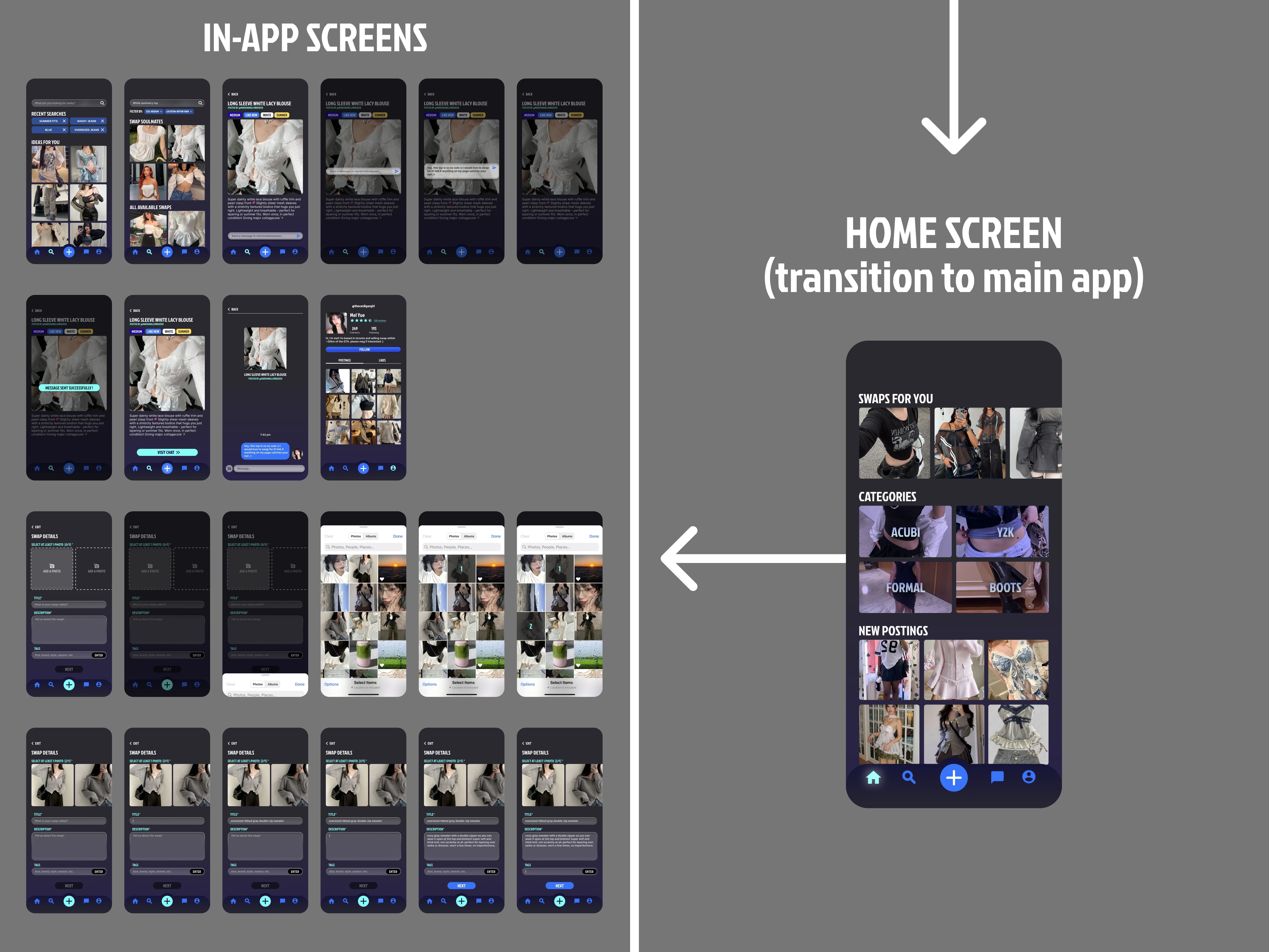
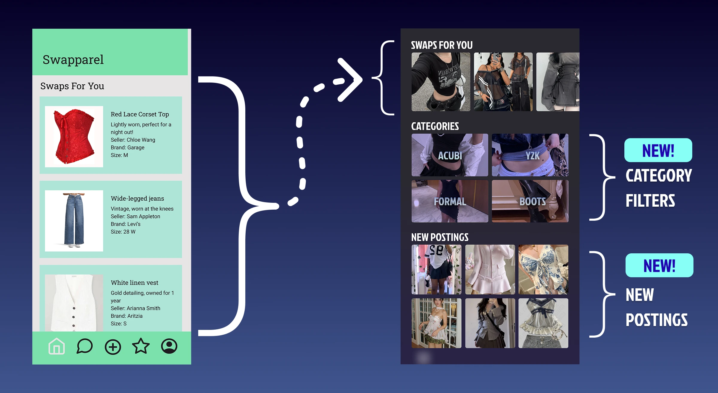
Home Page Explore Sections
Inspired by the Depop landing and Instagram explore pages, we decided Swapparel, too, needed a place for users to browse various categories, rather having only a few recommended swap options. Since our customers would be fashion and aesthetic-driven teens/young adults, we designed the recommended filters to be modern fashion style categories (i.e. acubi, y2K) rather than clothing items.
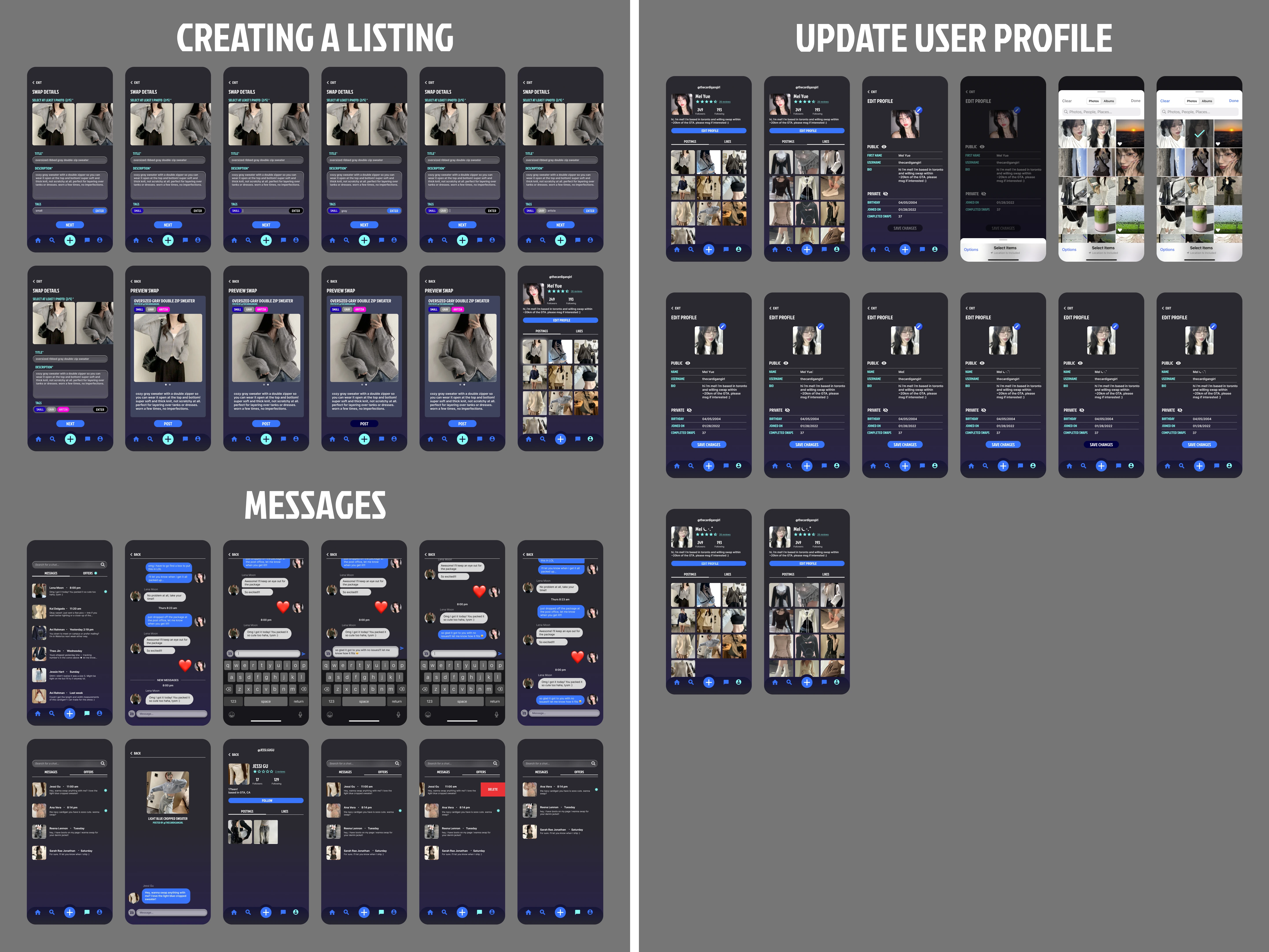
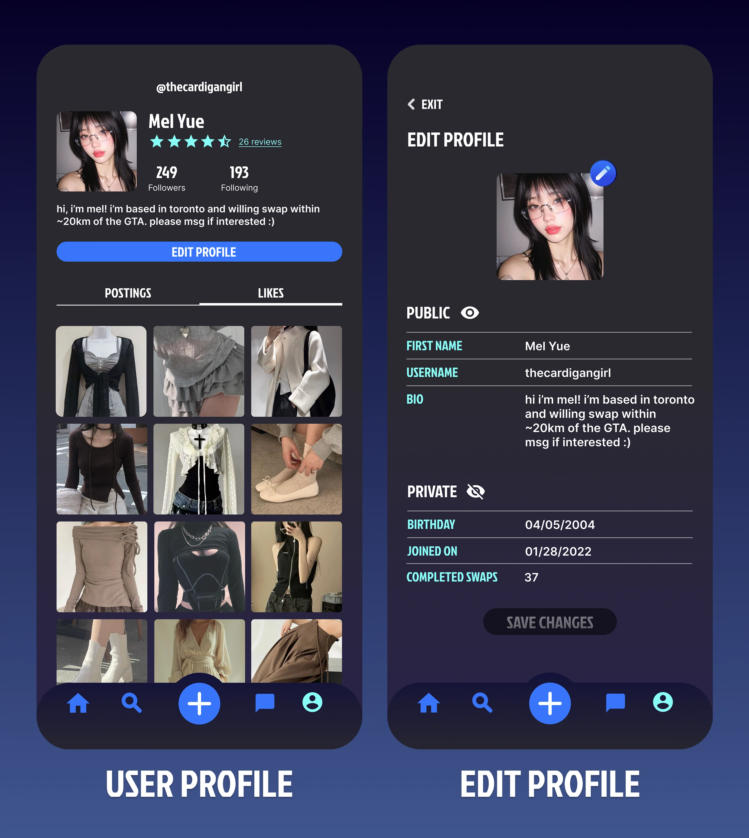
User Profile
The addition of a user profile page would serve two purposes:
1. Allow interested customers to browse through a user's full catalogue of items (which will likely be of a similar style).
2. Add a sense of security and accountability for the user's swapping history through ratings and reviews.
To keep the experience familiar and intuitive, we took inspiration from Instagram's profile page UI.
Final Designs
Video Walkthrough
Narrated by me!
Here Are All The Screens We Made...😱